Consort: A Case Study
Logo Redesign
Consort Windows needed a fresher look for their logo:
The Original
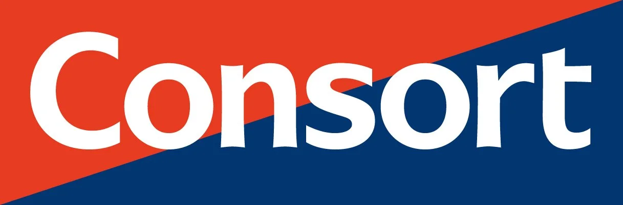
The original logo was outdated, of poor quality, and the text “Consort” was far too large within its box. Looking at the colours of red and blue, I already knew that I had my work cut out for me. The first thing I wanted to do was measure the scope of the redesign, so I created various options that ranged from major to very subtle. After creating many, many designs, they were narrowed down to the three below:
Option 1

Option 2

Option 3
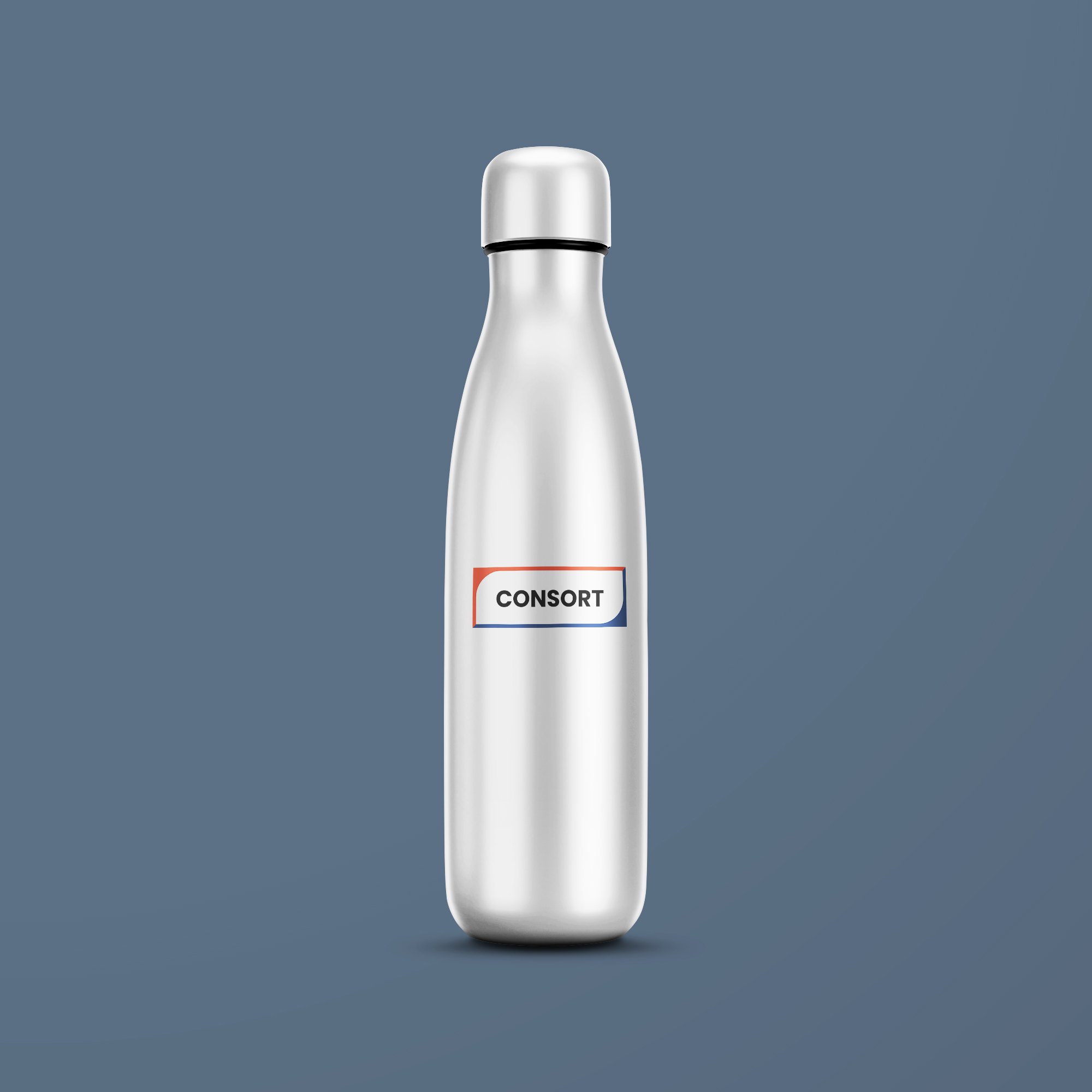
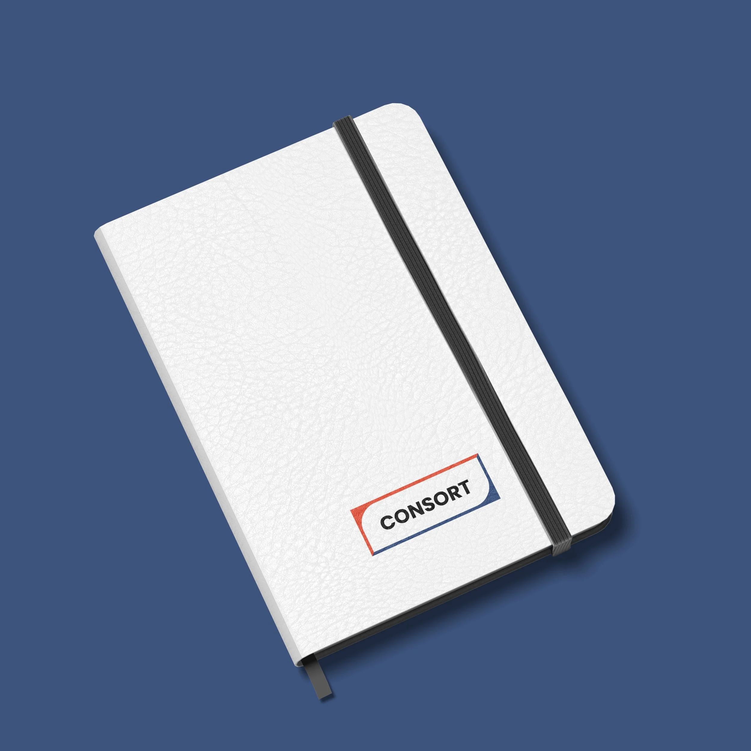
Option 1
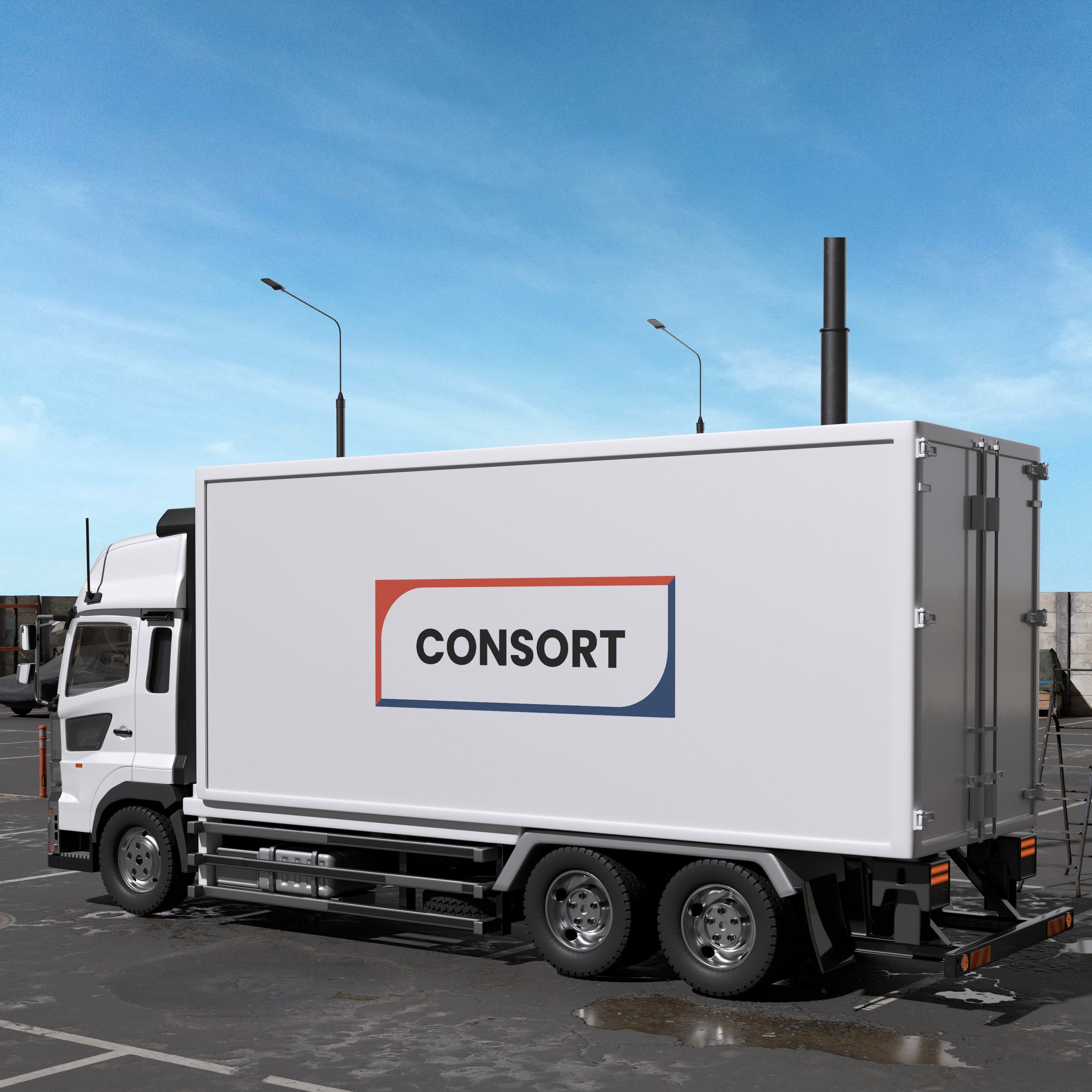
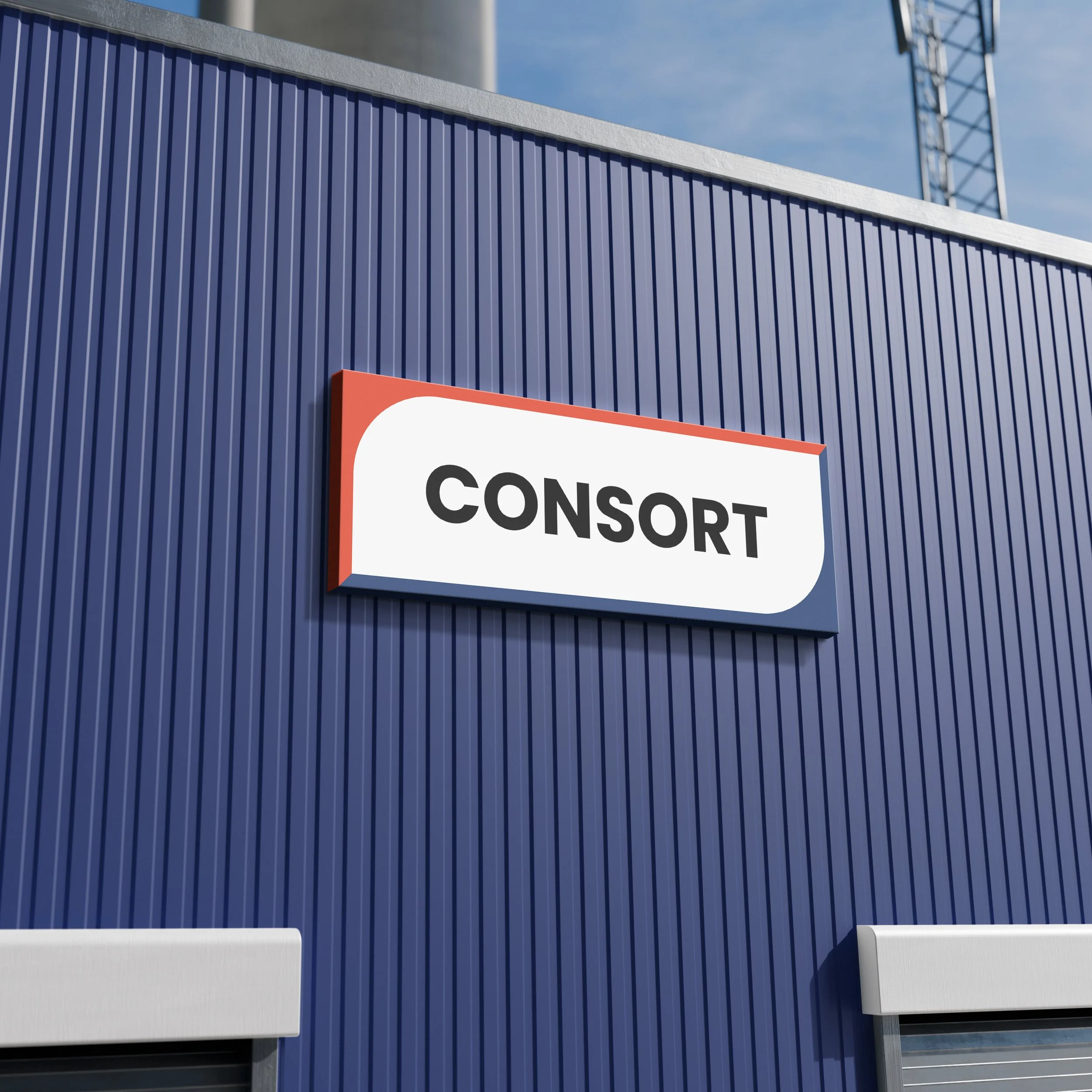
Retaining the red and blue, I wanted to add relief to the rest of the branding by creating open space between the text and the coloured strokes. This no longer restrains the branding to the block red, white and blue. I also wanted to use a font to give the impression of strength, stability and quality by introducing bold capitals; all whilst remaining true to the brand and modernising the look.
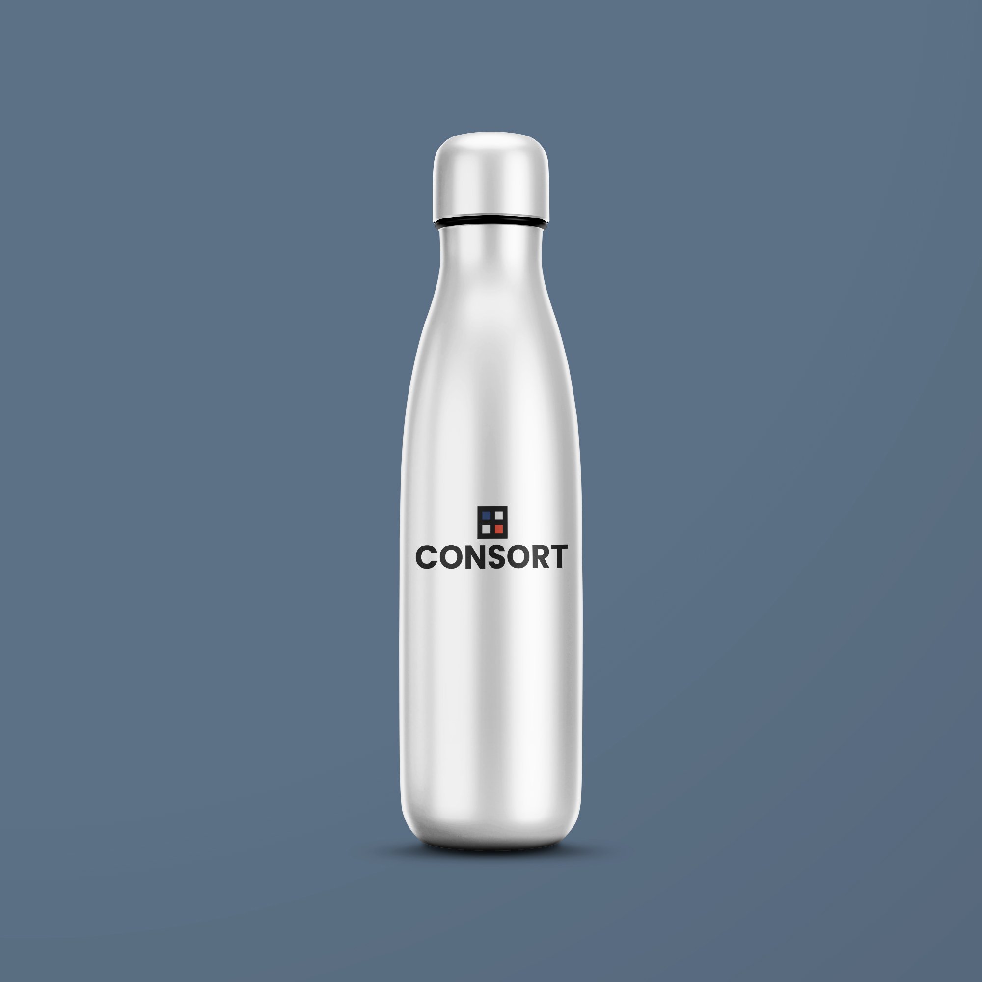
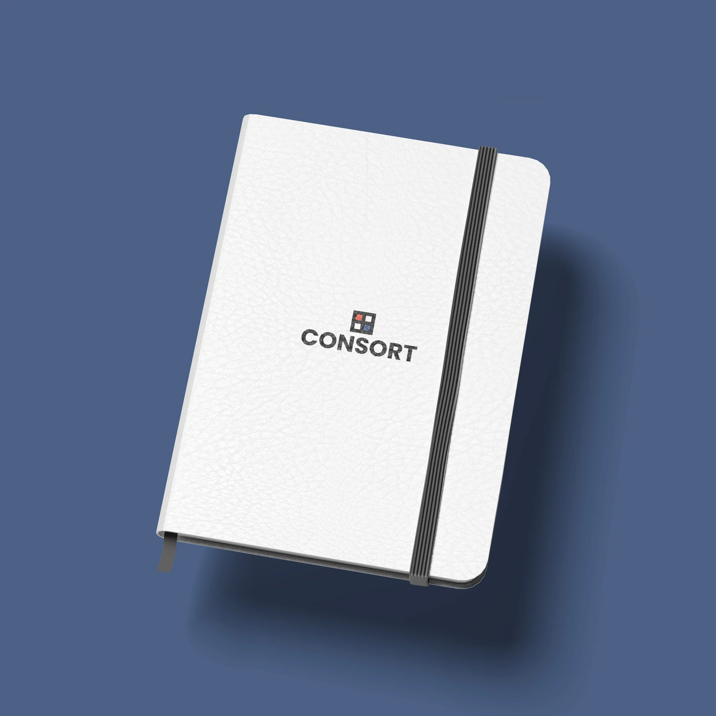
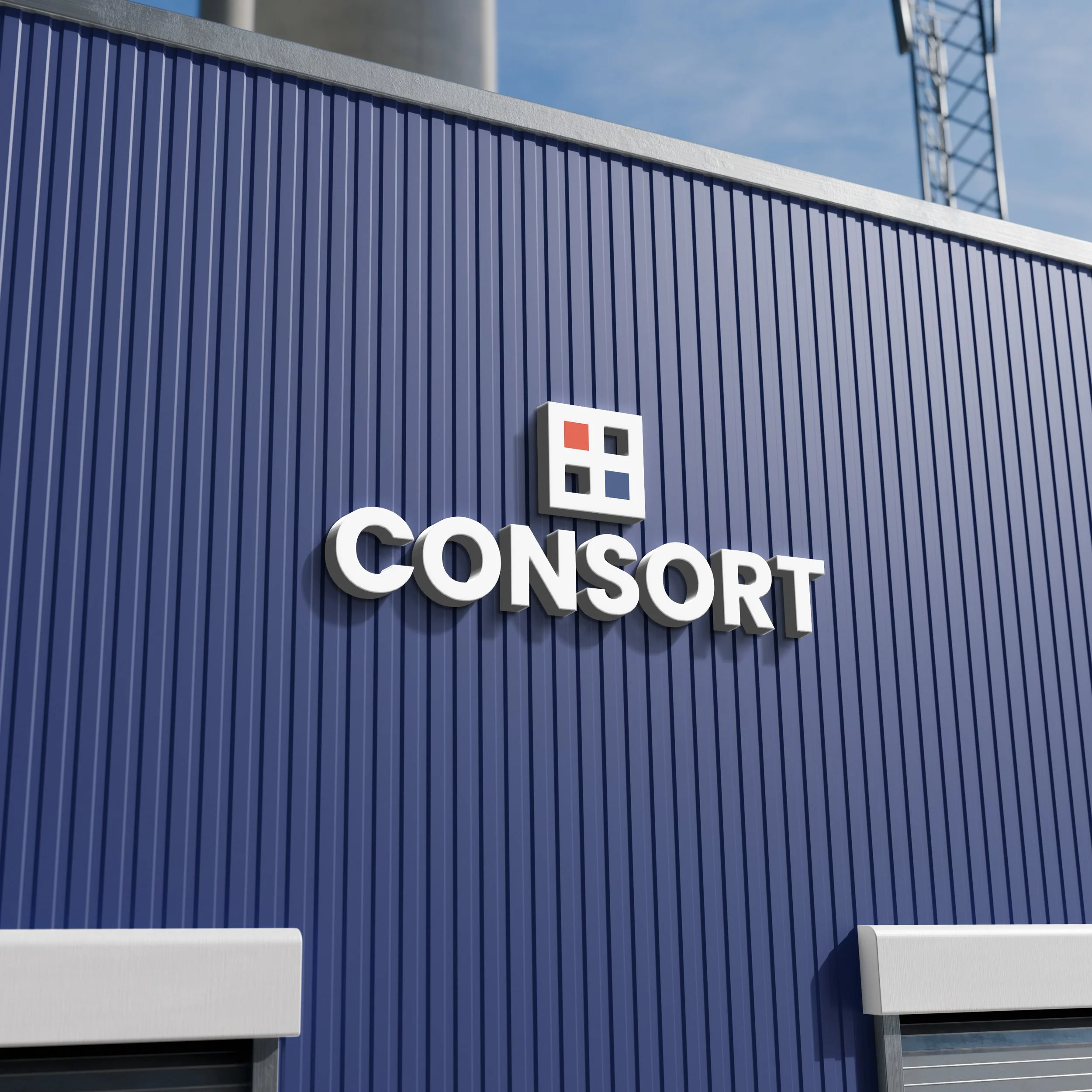
Option 2
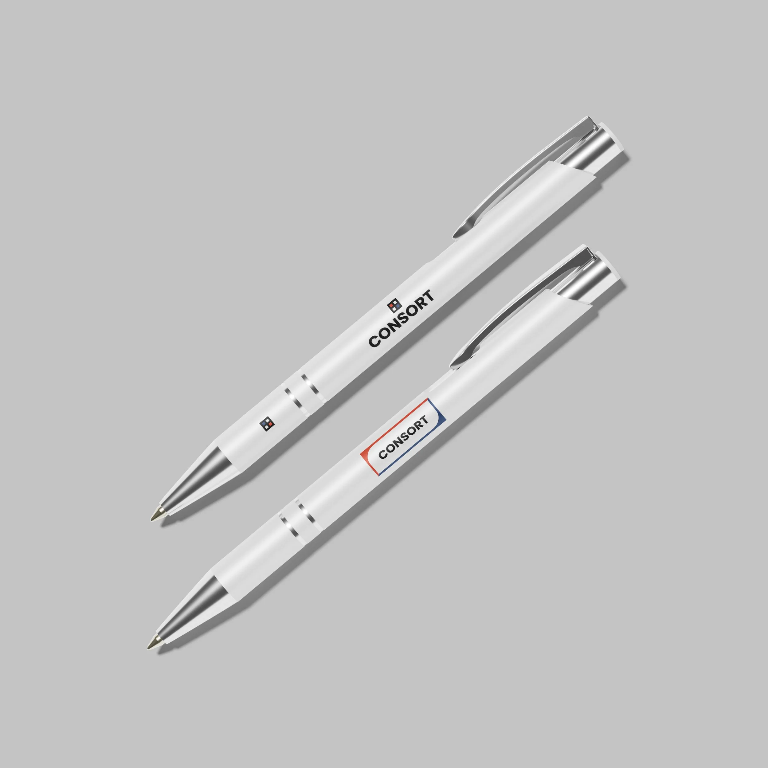
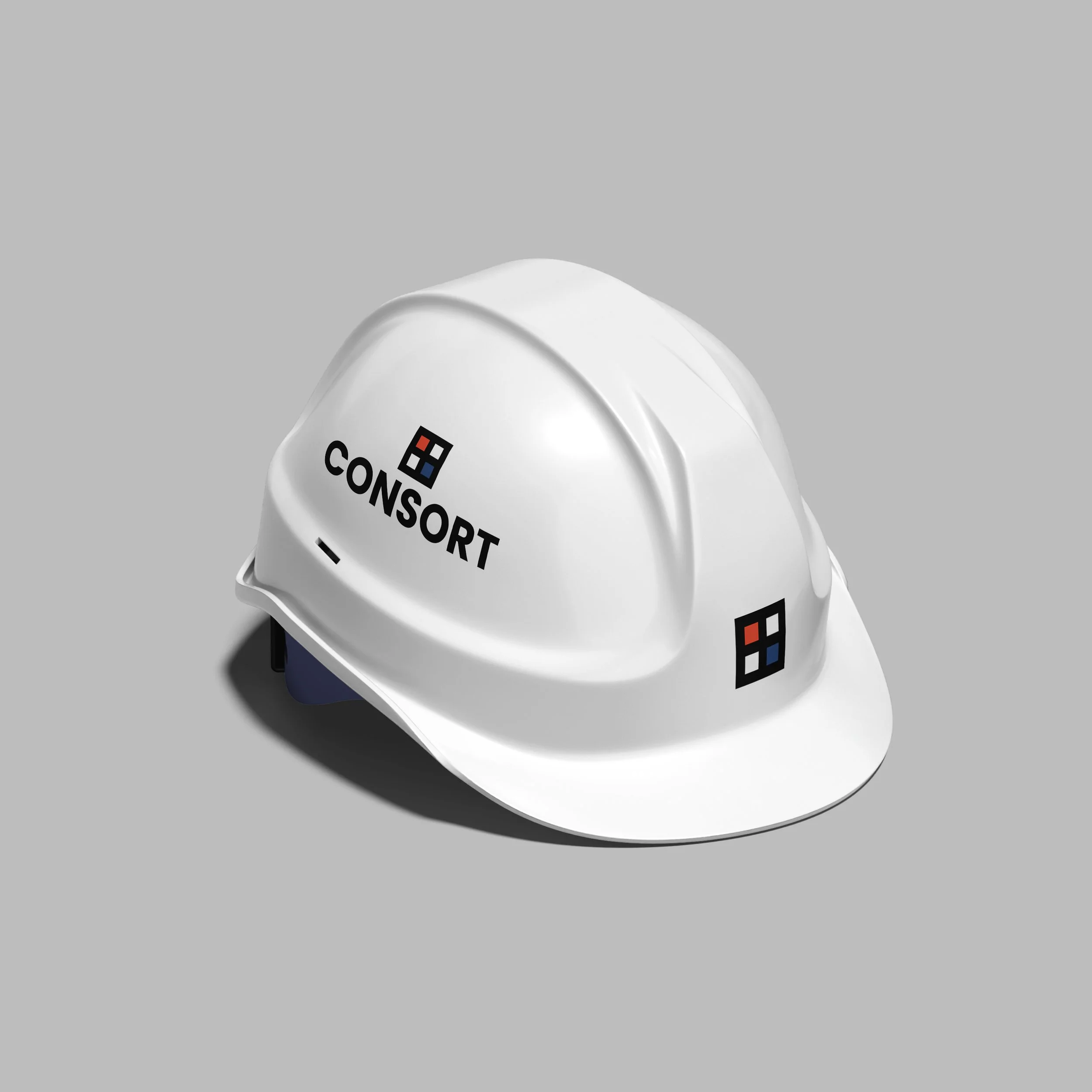
My personal favourite. A complete reimagining — modernised, versatile, and built to inject new life into the brand. The bold capitals stay. The box is gone — replaced with a pictorial mark that works as both a wordmark companion and a standalone symbol. The square serves multiple purposes: an instantly recognisable identifier, a subtle nod to a window, and a respectful continuation of the previous logo's red and blue diagonal blocks. Versatile, ownable, and built for a company of Consort's scale.
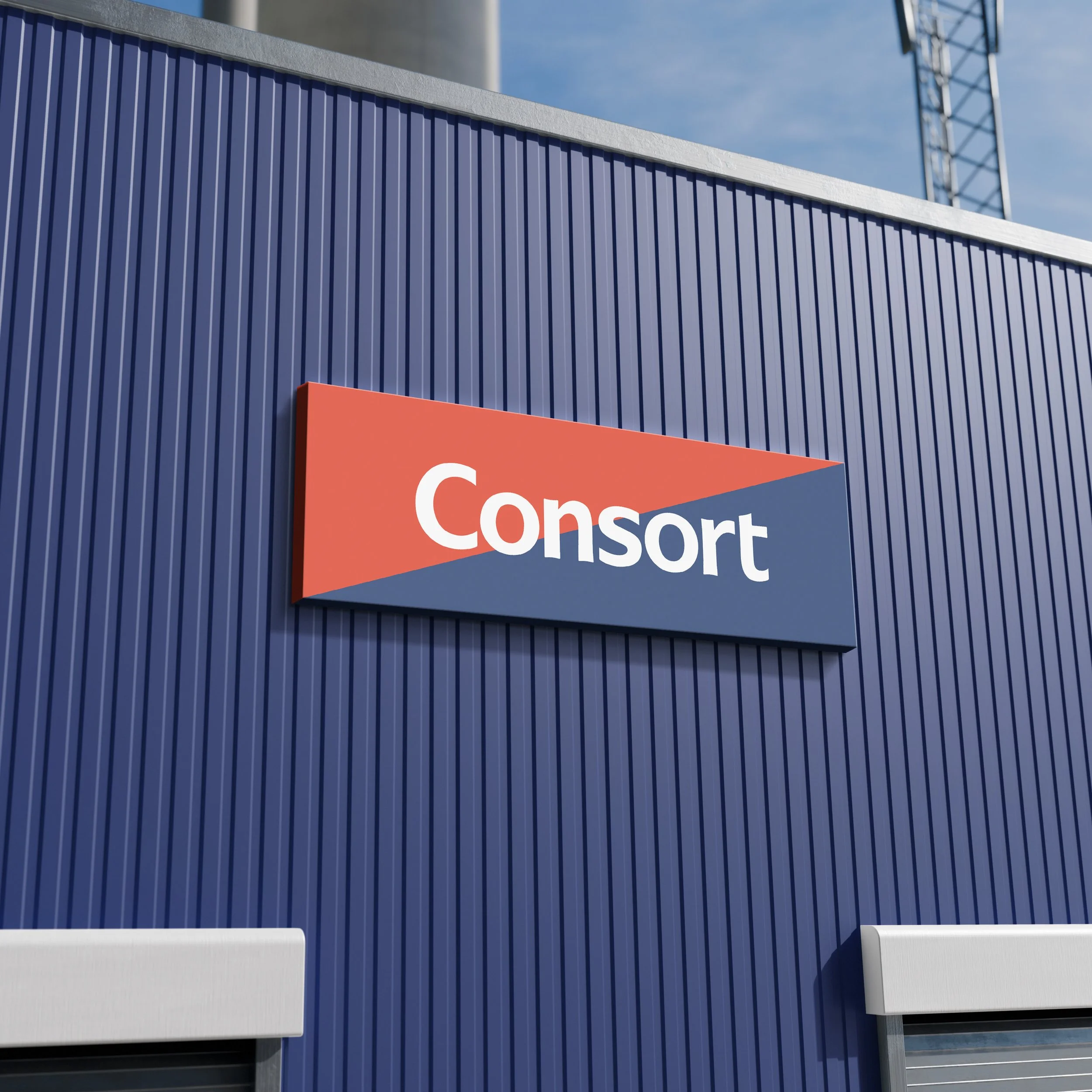
Option 3
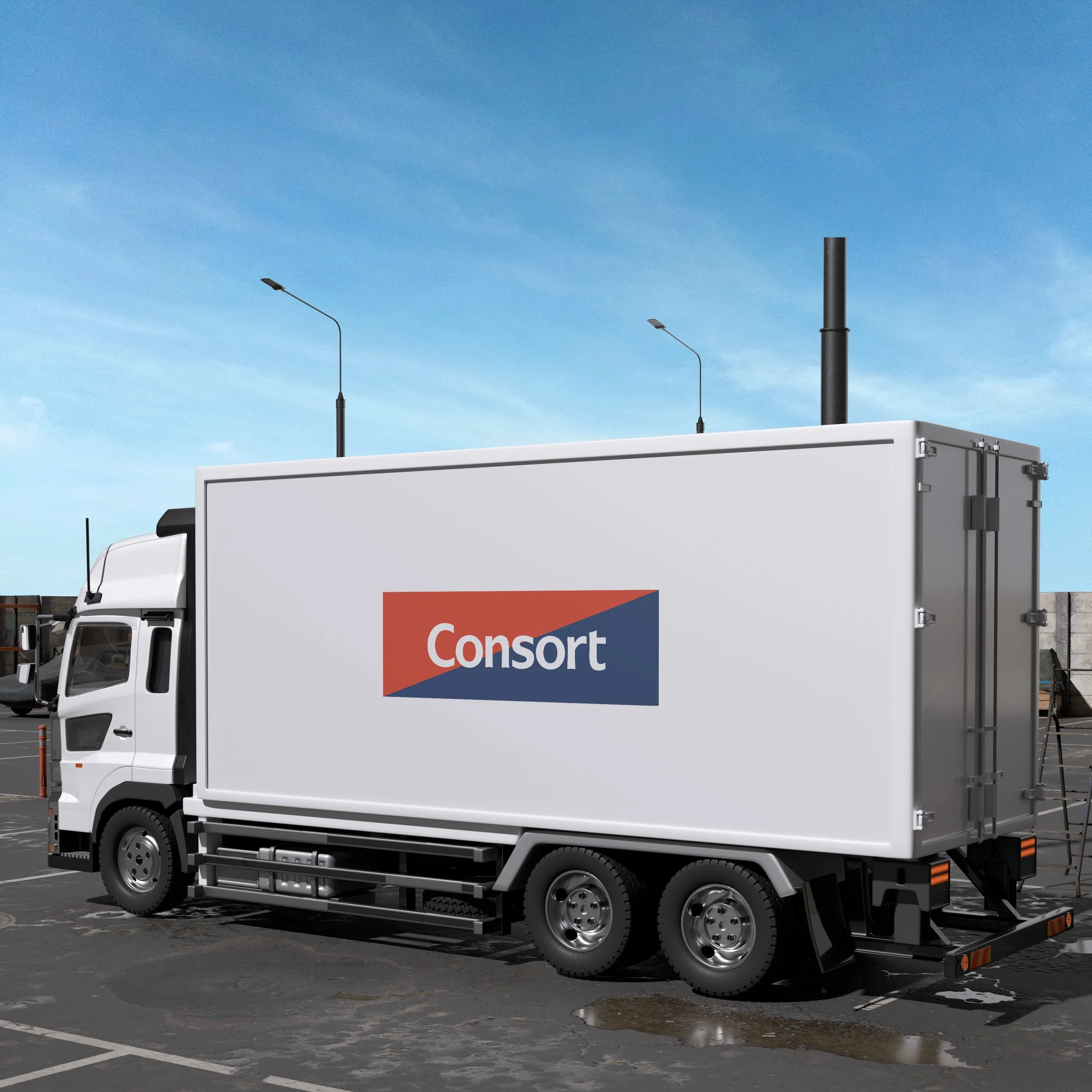
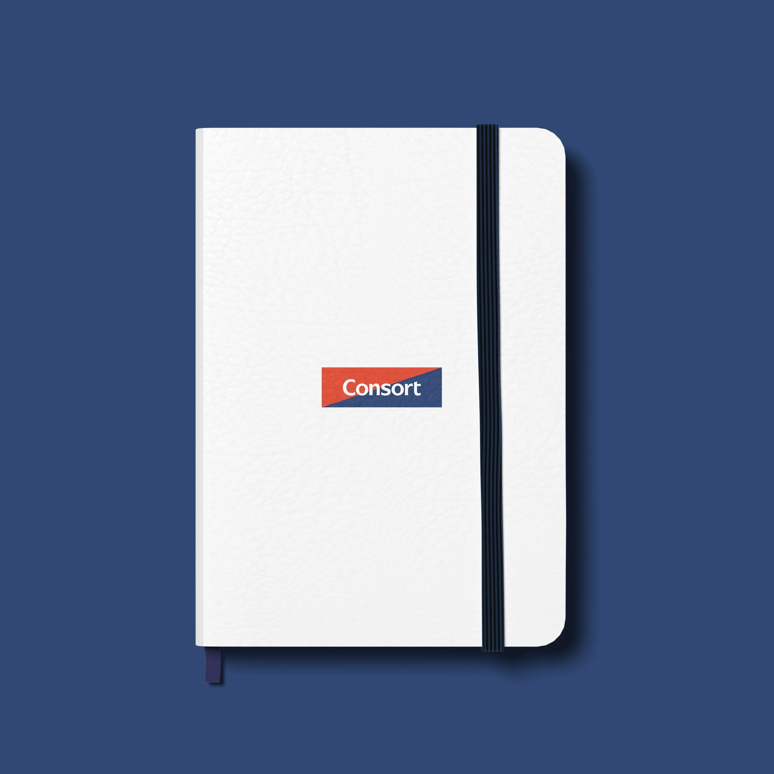
The safe option. A polished refresh of the existing logo — same shape, same colour blocks, same character — but cleaner, more refined, and more contemporary in execution. Designed for cost-effectiveness and continuity. The kind of update that respects what's already there while quietly bringing it forward. A sensible middle ground for a brand that doesn't want to start from scratch.

Which one is your pick?
Let’s Make it Happen
Lets talk about it